Even when a website looks modern and consistently attracts traffic, real results can remain elusive. Users often land on a page, scroll through a few sections, and leave without engaging – even when everything seems to be done correctly. In such cases, the problem lies not in the appearance but in the site’s ability to hold attention, spark interest, and lay the groundwork for meaningful action. What matters is not design on its own, but how clearly the offer is presented, how quickly the content is understood, and whether the structure allows smooth and effortless navigation. To achieve this, it’s important to understand from the start how to improve user engagement on a website and which elements deserve the most focus. Let’s explore this in more detail.
What influences user engagement
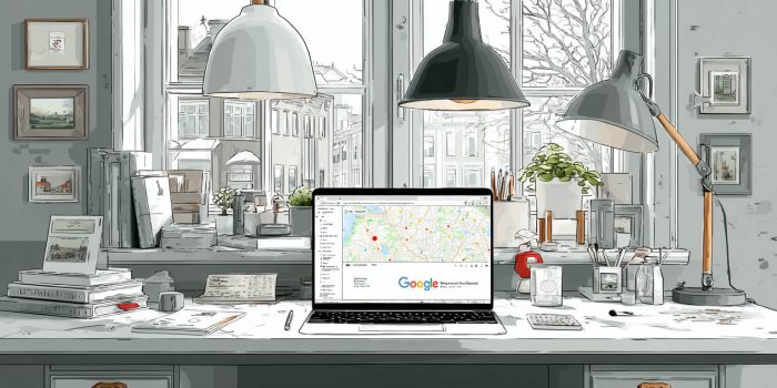
Engagement is not driven by visual effects, but by how easily users can orient themselves on the site, how quickly they find what they need, and whether they want to stay longer. When the structure functions as a cohesive whole, navigation feels natural, and every element supports the overall flow, attention is retained without effort. That’s why it’s essential to define how to write a proper technical specification before development begins – one that reflects audience expectations, the format of your services, and the desired user behavior.
To keep users engaged and prompt them to act, a website must accommodate different behavior patterns. Some visitors arrive with a specific query and want to find information quickly. Others take their time exploring, focusing on content and visual cues. Still others browse casually, reacting only to highlighted elements. If the structure allows users to proceed at their own pace without causing friction, natural engagement forms – gradually evolving into real interaction.
Practical solutions that work
When discussing the benefits of building a multi-page website or any other type of resource, we always emphasize a few key aspects that directly impact the success of the project:
- Introducing interactive elements. Animation, dynamic blocks, and visual effects create a pleasant impression and encourage interaction, significantly increasing session duration.
- Personalized CTAs. Buttons that clearly convey the intended action and align with user expectations increase click-through rates and directly impact the business’s conversion performance.
- Messenger integration. Familiar messaging platforms offer convenient communication channels, enabling users to request help without switching pages.
- Behavior-based adaptation. When content adjusts based on traffic source or previous user behavior, it creates a sense of personalization that increases time on site.
- Structural updates. Reorganizing blocks based on content logic and user behavior aligns reading flow, reduces cognitive load, and improves page efficiency.
- Strategic promotional blocks. When ad content is contextually placed within relevant sections, it supports the overall strategy and encourages users to proceed to the order form without resistance.
- Emotional engagement. Visual content, text highlights, and a well-paced presentation stimulate interest and boost user energy – increasing overall loyalty to the site.
How content holds attention
Website content works only when it doesn’t interrupt the user’s flow, doesn’t overwhelm with detail, and avoids information overload. If the content is easy to read, core messages are clear, and the visual logic naturally guides the user forward, attention is held without additional effort. This kind of presentation creates a sense of order – every block contains meaningful content, not just filler. For a detailed example, see the article on websites for preschools, which clearly illustrates how to structure content and deliver it effectively.
When content truly works, it doesn’t duplicate design functions or rely on visuals. Instead, the flow of information sets the pace for perception and builds a sense of stability within each section. A well-designed structure sets logical accents, leads toward action, and avoids cluttering the page with secondary information. Everything presented clearly and consistently builds trust – even when the topic is complex or unfamiliar. Content that’s understood at first glance through simplicity and clarity holds user attention and encourages further exploration.
How to keep users on your site
In some cases, even great content and solid structure don’t guarantee user retention. If visitors encounter confusion, hesitation, or friction during browsing, interest fades quickly. To prevent this and ensure a comfortable experience, several core aspects should be prioritized:
| Natural logic. | Navigation, content delivery, and feedback all work as a unified whole. Users don’t have to think about how the page is built – they simply move forward without friction. |
| Balanced pacing. | Viewing speed is shaped not by scroll rate, but by the structure of each section – whether block sizes are even, layouts are consistent, and visual cues are well-spaced. |
| Purposeful actions. | A button appears just after the user finishes reading a section and is ready to move on. It doesn’t break the flow – it supports it, leading to the next step with no hesitation. |
| Convenient contact forms. | Forms aren’t forced stops – they appear naturally at a moment when interest is already formed and no further convincing is needed. |
| Full mobile responsiveness. | The mobile version isn’t a simplified replica – it preserves the same logic, structure, visuals, and content. Users shouldn’t feel like they’re viewing a reduced version of the site. |
| Content presentation. | Every text block is presented calmly and sequentially. Headlines clearly explain the topic, new information is digestible and non-distracting, and the user’s attention is guided steadily through the page. |
| Predictable behavior. | When users click on any element, they land exactly where they expect, with no unnecessary transitions or confusing shifts – building confidence in each next step. |
Which improvements your site needs after launch
In most cases, mistakes in landing page design or website performance stem from treating the project as “finished” at launch. But launching is only the beginning – continuous improvement is necessary to keep users engaged. These updates may include:
- A/B testing of elements. Comparing real-world versions of buttons or headlines reveals which performs better and informs future optimization.
- Adding new content formats. Introducing video, interactive features, or brief explainer sections enhances perception and brings the page to life, boosting engagement.
- Visual updates. Refreshing the design helps avoid looking outdated, sustains trust, and creates a positive first impression for new visitors.
- Flexible CMS block management. The ability to independently update sections of the page without involving a developer speeds up content changes and allows better control.
- Automated display logic. Showing specific blocks based on user actions or traffic parameters increases content relevance with minimal effort.
- Traffic-source personalization. Visitors from different ad channels land on customized page versions with adapted headlines, visuals, and offers that match their expectations.
- Analytics-driven improvements. User behavior data – clicks, scroll depth, comments, time on page – highlights weak points and justifies redesign or updates to specific blocks.
Looking to order a new website or update your existing one to improve user engagement? No problem. Our website development web studio takes an individual approach to every project, carefully considering the client’s preferences and real business needs. With a comprehensive process and a clear focus on business specifics, we ensure the final result meets your goals. Get in touch – the QuatroIT team is here for you!