A website can be neatly assembled, logically designed, and free of technical flaws. Yet once it’s launched, it often turns out that some elements don’t work as expected. In real interaction with users, it’s the small details that begin to affect the overall perception – the navigation may feel confusing, some content blocks may be hard to understand at first glance, and certain elements may go completely unnoticed. These issues are not always obvious, but they are often the decisive factor in whether a user takes the desired action, stays on the site, and wants to return. Over time, such flaws reduce the overall manageability of the resource, disrupt the user flow, and create a need to revisit the structure, content, and logic of interaction. So let’s look into how to improve website usability after launch, when it’s truly necessary, and which issues should be addressed first during an update.
Signs of usability issues – what to pay attention to
In practice, the decision to request a website redesign is usually prompted by a few common factors. These typically include:
- High bounce rate. When users leave immediately after landing, it’s often due to poor emphasis, lack of content depth, or a failure to clearly communicate value to the audience.
- Low conversion rate. If traffic is stable but users aren’t completing target actions, it’s worth reassessing the functionality, how well it’s tailored to user needs, and the overall interaction logic.
- Users don’t complete intended actions. This often stems from an overloaded layout, unintuitive navigation, or a form that’s too complex and disrupts the behavioral flow.
- Complaints or questions about obvious things. Repetitive inquiries point to a weak interface that doesn’t account for user experience and fails to offer a clear interaction model even for basic actions.
- Abnormal behavior in heatmaps. If clicks concentrate in unintended areas, it could mean that the color scheme doesn’t support visual hierarchy or that overall page balance is off.
- Difficult-to-use forms. Extra fields, vague hints, and unstable validation can significantly reduce usability, lower conversion, and damage trust.
- Inconsistent visual presentation. When fonts, layout, and structure lack visual harmony, the interface looks unfinished, making it harder to hold attention and less pleasant to use.
Collecting user feedback
After a website launches, actual user behavior often differs from what was anticipated during the planning stage. That’s why feedback should be gathered not when issues accumulate, but during interaction – the moment a user fills out a form, clicks a button, or can’t find key information. The most effective formats are simple: a quick question after completing an action, a micro-survey with an open field, or a popup that doesn’t interrupt the session. This method doesn’t distract the user but captures their immediate reaction – without delay or distortion.
Feedback becomes valuable when it reveals not just random emotion, but recurring signals reflected in both words and actions. If users ask the same question multiple times or abandon actions at the same point, that marks a spot worth analyzing through digital metrics – click count, exit page, or scroll depth. Technical support also often receives repeated complaints about the same issues. When patterns align, it becomes clear which fragment needs revision and what should change in its structure or delivery.
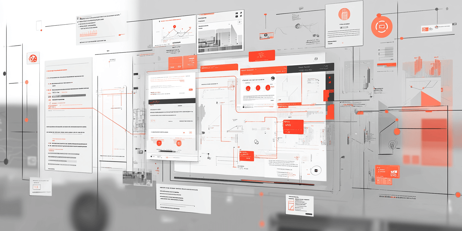
Tools for assessing UX after launch
Once the site is live, it’s crucial to track overall performance and understand how users engage with each element. Specific tools help evaluate UX based on real data rather than assumptions. The most valuable among them include:
- Heatmaps and scroll maps. These highlight which areas users focus on, what goes unnoticed, and whether key content is placed effectively.
- Google Analytics metrics. This tool tracks how users behave – where they come from, how they navigate, where they stop, and why they leave.
- A/B testing. By comparing different versions of buttons, forms, or headlines, you can identify which ones improve engagement and lead to target actions.
- Page speed testing. Tools like GTmetrix reveal how quickly each page loads and whether technical lag is interfering with user experience.
- Responsiveness and accessibility checks. The interface should work well across all screen sizes, retain logic, and remain stable under various conditions.
- Click and CTA analytics. This testing shows which elements actually function as calls to action, how noticeable buttons are, and whether their design meets user expectations.
Improvements that make a real impact
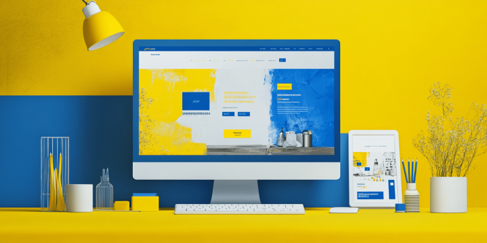
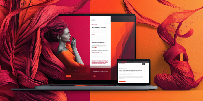
When explaining the benefits of custom web design to clients, we always recommend a comprehensive approach that focuses on several interconnected aspects – each contributing to the overall result:
| Navigation and logic. | When the site structure is clear and transitions between sections are intuitive, user errors decrease and interaction becomes more effective. |
| Simplified forms. | Optimized fields with clear prompts reduce friction, make data entry more comfortable, and prevent drop-offs due to cognitive overload. |
| Button optimization. | Call-to-action elements that stand out visually, are placed logically, and are paired with clear text help build a stable engagement path. |
| Mobile adaptation. | A fully functional mobile version should consider screen constraints, interaction speed, and element size, maintaining usability without compromising functionality. |
| Content structure. | Proper arrangement of text and blocks supports clarity and relevance, keeping the user focused on key actions without overwhelming them. |
| Loading speed. | Even a few seconds of delay can affect retention, so timely optimization of code and images is a vital part of technical maintenance. |
Step-by-step strategy for implementing improvements
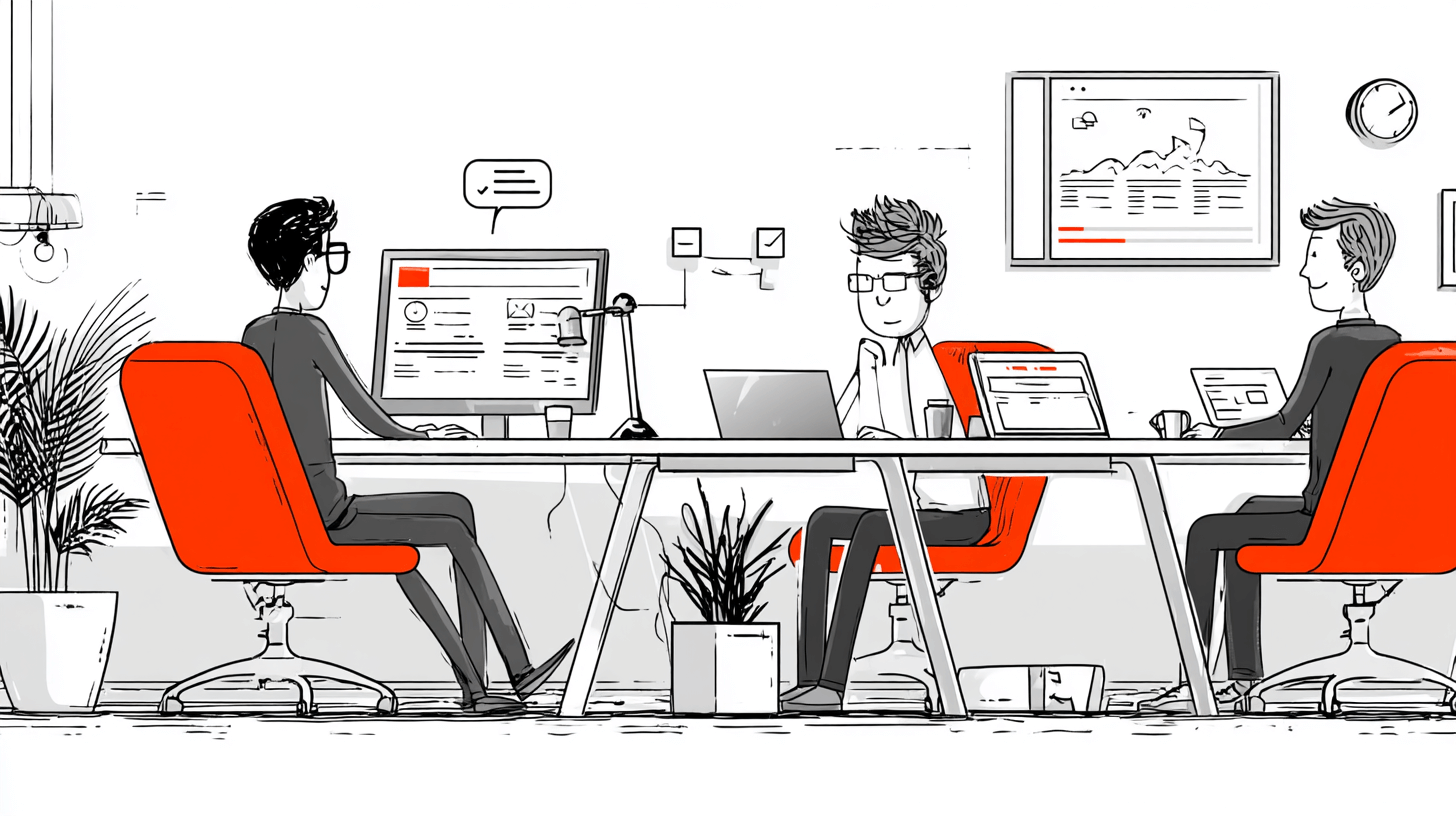
At our web studio, we follow a multi-stage process to improve usability, treating each project as a full-cycle effort:
- User behavior analysis. We examine how visitors navigate between pages, where they pause, where they get lost or backtrack. This reveals logical breakdowns and performance drops.
- Identifying weak points. We audit the interface, layout, and content to detect blocks that confuse users, feel overloaded, or fail to support the expected interaction.
- Preparing a change list. Based on collected feedback, we compile a list of updates, divide them into phases, and agree on an implementation timeline with prioritization based on project goals.
- Implementing technical solutions. We update functionality, adjust visuals, and restructure content – all without compromising site stability or disrupting existing logic.
- Result verification and refinement. After implementation, we run A/B tests, compare key GA metrics to baseline data, and refine certain elements based on new feedback.
- Long-term planning. We establish a timeline for future updates and ensure scalable development, keeping UX current through regular updates and technical support.

Is your website no longer serving its purpose? Are leads dropping, visitors ignoring your offer, and you’re unsure what to do next? In this case, don’t waste time – contact a web studio that can help you identify the causes and offer practical solutions. The QuatroIT team will assess the current state of your site, provide insights on website development for small businesses, and handle every stage of modernization – from analysis to implementation – while strictly adhering to all agreements. Get in touch – we’re here for you!