The homepage is the first thing a visitor sees when opening a website. It forms the initial impression of the company, gives an idea of the site’s structure, and sets the tone for further interaction. Within just a few seconds, the user subconsciously evaluates whether it’s easy to navigate, how trustworthy the presentation seems, and whether it’s worth staying – or starts looking for another resource. This decision is influenced not by one specific element, but by the overall coherence of the page – how clear its content is, how well-structured it feels, and how comfortable it is to perceive. Achieving this effect is challenging, but entirely possible – provided that all key components are thought through in advance. So let’s talk about how to properly structure the homepage of a website, which elements to focus on, and when it makes sense to consider updating an existing one.

What function the homepage serves
The homepage of any website serves several key functions at once. The most important of them are:
- Presenting the business and its value. The first impression is formed on the homepage – the user evaluates what the company does, who the offer is intended for, and what advantages it declares. This is achieved through the headline, description, visual elements, and the logic of the structure.
- Encouraging interaction. A well-executed call to action in the form of a button, form, or interactive block allows you to immediately offer the user to submit a request, make a call, or take a specific action.
- Building trust in the brand. With thoughtful design, a balanced tone of text, high-quality visuals, and a user-friendly interface, the page conveys a sense of professionalism, reliability, and openness.
- Organizing site navigation. The homepage serves as a logical entry point, helping users quickly understand the structure, navigate to the right sections, and grasp how the content is built throughout the resource.
- Initial SEO setup. Through properly configured markup, meta tags, sitemap, document language, and page load speed, the homepage creates a foundation for indexing, which determines how well the site will be represented in search results.
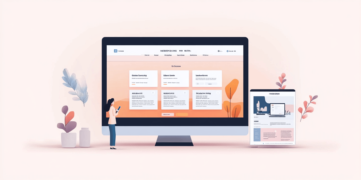
Which blocks should appear on the homepage
To all our clients interested in turnkey website development, we strongly recommend paying special attention to the homepage structure. It should include several mandatory blocks, each serving its own purpose while working together toward a common result. Among them are:
| Headline with positioning. | This is the first thing users see, so the headline must reflect the page’s topic, clearly convey the offer’s essence, and emphasize the company’s value through a strong message and overall presentation. |
| Supporting description. | A few sentences below the headline that elaborate on the offer, clarify who it’s for, and help shape the right perception from the very first seconds. It’s especially important here to choose the right tone and avoid vague generalities. |
| Structured menu. | At the top of the page, there should be a user-friendly menu with a logical layout, adapted for different devices and understandable even during a quick glance. This is a key navigation element that improves usability and orientation within the site. |
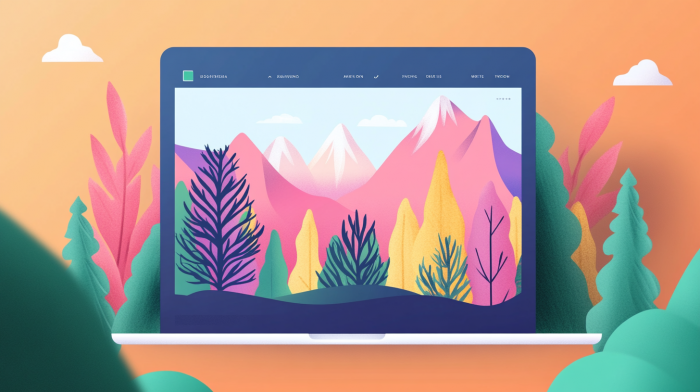
| Visual content block. | This may include a slider, logo, animation, video, or a photo series – not just as visual filler, but as a way to reinforce the message, create a mood, and form associations that benefit the perception of the brand. |
| Services block. | Whether grouped by category or shown individually, services must follow a clearly defined layout. Including short descriptions and clear icons makes them easier to scan and helps users quickly understand the company’s offerings. |
| Call-to-action (CTA) button or form. | A visible form or CTA should logically follow the preceding content block without being intrusive, clearly suggesting an action – request a service, ask a question, or leave contact details. |
What the homepage should look like visually
The text content must be clearly structured, concise, and focused on key messages. Every section should serve a purpose and logically follow the one before it, without repetition or unnecessary explanation. It’s essential that the text doesn’t duplicate other content on the page, distract from the main message, or rely on general phrases. Too much content can dilute focus, fragmented presentation breaks continuity. This is where the balance lies – whether a user wants to continue interacting with the page depends on it.
Visually, the most important elements are content-relevant photos, intuitive icons, a rhythmic grid, balanced spacing, coordinated colors, and properly selected fonts. All of this creates a background that supports perception and accessibility, allowing users to read, absorb, and act without hesitation. Buttons should be visible, and the overall style should reinforce the logic of the content rather than conflict with it. These are the elements that answer the question of how to improve website usability – because it is the harmony between text and design that creates user comfort and the page’s overall effectiveness.
Technical requirements for homepage design
The technical setup directly impacts how fast the page loads, how stable it is on mobile devices, and whether search engines index it correctly. If the site is slow to open, elements shift, or the content is not adapted for smartphones, users will simply close the page. These problems are often not caused by the platform or design, but by common mistakes made during landing page development – mistakes that go unnoticed during layout and testing. The result is lost traffic, reduced visibility in search, and a website that appears unreliable – even if the offer itself is attractive and competitive.
Proper homepage implementation prevents this. The page must fully support responsiveness, have correct HTML structure and clean markup, and integrate reliably with forms, maps, and various social media widgets. SEO is just as important – meta tags must be added, the sitemap configured, the favicon included, and load speed optimized. These details – though not visible at first glance – create the technical foundation of the page and reflect the company’s responsibility before the user even sees the content.
When you should consider updating your homepage
In practice, even the most well-thought-out and carefully built website eventually stops meeting the new demands of the business and the expectations of users. In such cases, the decision to order a new web design, carry out a redesign, or update technical aspects is entirely logical and justified. This typically happens in response to certain changes, such as:
- Outdated visuals or content. If the design looks dated, the colors and fonts are obsolete, and the content hasn’t been refreshed in a long time, the homepage stops appearing relevant and loses user trust.
- Declining conversion and rising bounce rates. A significant drop in engagement often indicates a mismatch between structure, visuals, and content logic. If users don’t know what to do next, even a clear CTA won’t work.
- Misalignment with current positioning. As the company evolves, it updates its services, refines its messaging, and redefines its values. If the homepage doesn’t reflect these changes, it becomes inconsistent with the business reality.
- Adaptation issues. Lack of responsiveness, incorrect markup, or style conflicts in the mobile version hinder navigation, turning even simple actions – like opening a form or clicking a button – into technical obstacles.
- Shift in target audience or marketing strategy. If the business starts targeting a new segment, the homepage must reflect this – in its language, structure, headlines, sliders, and imagery. What worked before is often irrelevant now.
- Lack of SEO updates. Without regular checks, site speed gradually slows, the sitemap becomes outdated, and third-party integrations lose relevance, reducing visibility and slowing down indexing.
- Outdated structure and poor navigation. If users can’t quickly find the information they need, the interface is overloaded, and intuitive links are missing – it’s time to revise the block layout and overall page architecture.
Thinking about launching a new website or refreshing an existing one? Want a truly effective tool that contributes to your overall success and generates measurable benefits for your business? No problem. Our team is ready to guide you through WordPress website development, provide all necessary consultations, and take on projects of any complexity or specificity. Get in touch – the experts at QuatroIT web studio will help you find the best solution!