When promoting services, it is important not just to place information on a website, but to present it in a way that precisely meets the user’s expectations and is perceived without unnecessary effort. After all, when a person lands on the page, they should immediately understand what is being offered, why it is relevant specifically to them, and what actions they need to take next. However, such a result is only possible when the structure is concise, and each block does not dilute the content but instead supports the overall logic and focuses attention on the main point. This is exactly the essence of an effective promotional landing page – with its compact and convenient presentation, it keeps the audience alert and maintains contact with them at every stage of viewing. Choosing this option has several undeniable advantages, so let’s discuss what the structure of a one-page website for advertising services contains and what you should keep in mind in more detail.

Why you should order a one-page website specifically for advertising
Unlike multi-page projects, where the user is forced to search for the necessary information and construct the viewing logic themselves, a landing page immediately builds a consistent perception of the service offer. All information is concentrated here on one page, which shortens the path to understanding the essence of the service and instantly creates the necessary impression. The content is delivered without gaps, unnecessary transitions, or logical jumps, which allows the load to be measured and creates a favorable environment for perception. As a result, the user not only receives information but absorbs it within the given context, which nudges them toward the target action.
This page structure format is equally useful when working with traffic, where it is important to quickly make changes while preserving the integrity of the structure. A landing page allows for updating individual blocks without interfering with the overall logic, enabling a fast response to behavioral signals from the audience. As a result, content is gradually refined, offers are adjusted in time, and visual elements are adapted without compromising the overall perception of the content. Such flexibility creates favorable conditions for testing, maintaining high landing page performance at every stage of the campaign.
Key elements of an effective advertising landing page
As our experience shows, effective development of a one-page website is impossible without a clear structure, the main elements of which are the following modules:
| Headline and subheadline. | These introduce the page with a clear and direct statement, immediately communicating what service is being offered, who it’s for, and what benefit the user will receive by staying. |
| Description with USP. | Helps capture attention by logically continuing the introduction and briefly explaining the specific benefit of the service, how it differs from similar offers, and why it deserves trust. |
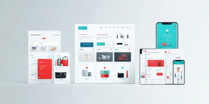
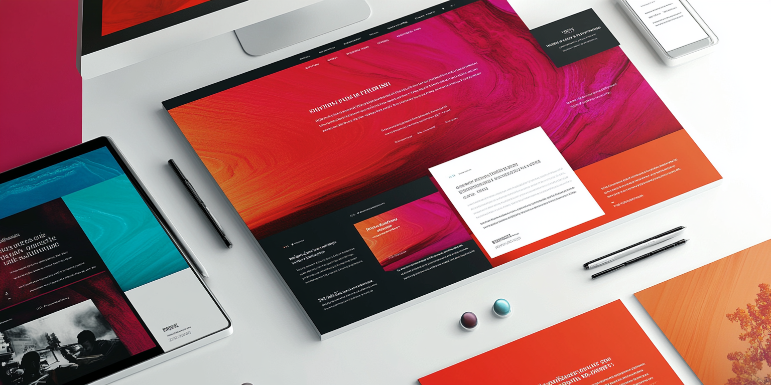
| Visual block. | Has both an aesthetic and informative function, visually complementing the text and allowing a quicker formation of an impression of the service’s essence, the expected result, and the level of execution. |
| Social proof. | Strengthens trust in the offer by showing real examples of interaction with clients, reviews, or case studies, helping to dispel doubts even before the first contact. |
| Call to action (CTA). | Formulates a specific action that the entire structure of the page smoothly leads to, clearly showing what exactly needs to be done after reviewing the offer. |
| Feedback form. | Concludes the overall structure with a functional block where the user can quickly leave a request or contact information without additional actions or unnecessary transitions. |
Stages of creating a one-page website for service promotion
When developing a high-conversion landing page, we act comprehensively, strictly following the following sequence of steps:
- Consultation with the client. We define the campaign goal, formulate the essence of the offer that the landing page should convey, and clarify which audience the communication is aimed at, so that the page meets the client’s real request.
- Content structuring. We build a viewing scenario, placing the blocks in such a way that the information is perceived sequentially, does not distract from the main idea, and leads the user to the target action without losing attention.
- Content preparation. We fill the structure with content, where each wording highlights the essence of the service, and visual materials help form a clear understanding of the benefits even before any interaction.
- Design and layout. Based on the approved structure, we create a visual solution that conveys the content in a format convenient for perception, and then implement the page as a responsive layout.
- Final testing. We check speed performance, functional stability, navigation, and usability of the page on various devices, eliminating even the slightest discomfort during interaction.
- Project launch. We publish the landing page, connect analytics, audit, and necessary services, and then transfer the finished version to the live domain for further operation.
What we do with a promotional landing page after launch
By offering comprehensive internet marketing, we do not stop at the moment of launch, because it is after publication that the website starts interacting with the audience. During this period, it is important to monitor how they behave on the page, where they pause, which elements attract their attention, and which go unnoticed. Behavioral data allows us to see not just general metrics but specific interaction scenarios that reflect the quality of perception of each block. This information opens the door to further optimization based not on assumptions but on the real actions of visitors.
Instead of a full redesign, we work with the existing structure, gradually improving it based on analytics and current results. At the same time, we do not change what already works but carefully strengthen weak points – updating content, clarifying accents, removing the excessive, and redesigning specific blocks. Thanks to this, the website retains its original idea but gradually adapts to audience behavior, becoming more precise in every fragment and more effective in overall perception.
Typical mistakes when creating a landing page and how to avoid them
When thinking about developing a promotional landing page, it is important to understand that professional website creation is impossible without thoughtful logic, where each element supports the overall idea and leads to the target action. In this format, the key is not the number of blocks or the color scheme, but precise wording, sequential delivery, and proper placement of accents. These details define the overall perception of the page, so inattention to detail at the initial stage often leads to typical mistakes that can reduce the effectiveness of even the most promising project. Among them:
- Uncertainty at the start. If the user doesn’t understand what it’s about within the first seconds, they won’t look for explanations but will simply close the page without even reaching the core.
- Generic or vague wording. Benefits that sound the same for any field don’t give a sense of real value and therefore reduce the relevance of the offer in the eyes of the audience.
- Broken delivery rhythm. When content lacks internal logic and transitions between blocks seem random, the user loses interest in the offer without even waiting for the final call to action.
- Overload with decorative elements. An excessive number of illustrations, effects, or graphics without functional meaning distracts from the main action and significantly complicates perception.
- Inconvenient or invisible form. If the contact block looks unremarkable, has a poorly thought-out structure, or gives off a technical impression, few will want to fill it out.
- Lack of a cohesive feel. A page that looks like a collection of separate fragments without consistent and unified logic fails to create a convincing impression and does not push toward action.
Each of our web pages with a unique design is developed based on the specifics of the advertising campaign, clearly taking into account the necessary aspects – from the nature of the audience to the content of the offer. We do not work with templates and are always ready to adapt the project to any budget and conditions, guaranteeing the result the client needs even in the most complex and non-standard situation. Interested in this approach and collaboration offer? Get in touch – the QuatroIT studio is at your service!
- Why you should order a one-page website specifically for advertising
- Key elements of an effective advertising landing page
- Stages of creating a one-page website for service promotion
- What we do with a promotional landing page after launch
- Typical mistakes when creating a landing page and how to avoid them