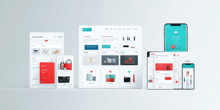
A well-structured landing page solves much more than it may seem at first glance. It does not just arrange sections across the page. It helps a person quickly understand where they have landed, what is being offered, and why this offer is worth paying attention to.
When a page is built chaotically, the user starts feeling lost within the first few seconds. One block pulls them in one direction, another repeats the same thing, and a third asks them to submit a request before they have even had time to understand the point. As a result, even a solid service or product can look weaker than it really is.
That is why a landing page structure should be thought through before the design, copy, and buttons. First, you need to understand what action the visitor should take, what questions they are likely to have along the way, and in what order the information should be presented. Only after that does it become clear which blocks the page actually needs, what can be removed, and what, on the contrary, should be strengthened.
When planning the page structure, it is important to first understand what a landing page is and how it works for business, and only then move on to the logic of the sections, the order in which information is presented, and the decisions that make it truly user-friendly.

Where to start when planning a landing page structure
Planning a landing page structure should start with one simple thing that is often overlooked. You need to define not the general topic of the page, but the specific offer a person will see in front of them. Not just the company’s services, not just a product for sale, but a clear offer with a specific message. What exactly is being offered, who it is for, under what terms, and why it is worth considering right now.
At this stage, it is important to gather all the core content of the future page into one working foundation. This includes the offer itself, key benefits, limitations, strengths, ways to build trust, the lead form format, answers to common objections, and everything that can genuinely influence the user’s decision. If this is not done from the start, the structure later begins to take shape at random, and blocks start appearing during the process without any solid logic behind them.
Next, the information needs to be divided into primary and secondary. This is one of the most important parts of the planning process. On a landing page, not everything carries the same weight. There are things the page cannot work without, and there are details that can be added only after the main content or left out entirely. If everything is packed into the hero section, the top blocks, and the area near the lead form, the user does not see what matters most. As a result, the page may look full, but its focus feels blurred.
Even before writing the copy, it is useful to decide separately what absolutely needs to be reflected in the structure. For example, for some landing pages, price, timelines, or examples of work will be critically important. For others, it may be the workflow, guarantees, case studies, or a trust section. This is where the real work on the structure begins, because it becomes clear which messages should appear higher up and which can go further down the page.
What should be defined before building the structure:
| Main offer | So the page does not fall apart into several different offers |
| Main conversion goal | So the structure leads the user to one clear outcome |
| Key benefits | So the value of the offer is immediately clear |
| Trust factors | So you understand in advance what will support the claims on the page |
| Customer objections | So the structure includes answers to doubts without unnecessary filler |
| Secondary elements | So the page is not overloaded with things that do not help conversion |
After that, you can move on to a rough page framework. Not the design, but the block layout itself. At this stage, a simple logical order is enough. What the person sees first. Where they get the main benefit. At what point it makes sense to show the benefits. When it is appropriate to add a trust section. Where the lead form will feel natural rather than pushy. A wireframe helps you look at the landing page as a step-by-step journey rather than a collection of separate sections.
Put simply, planning the structure does not start with visuals, but with arranging the content by priority. If you first understand what exactly the page needs to say, in what order it should say it, and what it cannot do without, building a strong landing page becomes much easier from there.
What blocks a user-friendly landing page should include
A user-friendly landing page does not necessarily have to be long. But it almost always has to be logical. A person should not have to guess what each next block is trying to say. Good structure works in a simpler way. It gradually introduces the offer, shows its value, removes doubts, and only then leads the user toward action.
The mistake many pages make is that the blocks themselves seem right, but they are put together without any sense of sequence. In some cases, the benefits appear before the person even understands what is being sold. In others, the form shows up before the page has had time to build trust. And in other cases, everything is stretched out so much that only a few people make it to the conversion point. That is why it is important to understand what role each block plays and why it is placed exactly where it is.
Hero section
The hero section takes on the hardest task. It needs to quickly explain what exactly is being offered, who this solution is for, and why it is worth staying on the page for at least a few more seconds. If the top part of the landing page is too vague, overloaded with details, or trying to say everything at once, the user simply will not connect with the main idea.
A simple combination usually works best here. A clear headline. A short clarification of the offer. A visible next step the user can take. And a visual element that does not distract from the message. The hero section does not need to sell everything down to the last detail. Its job is different. It needs to show that the page is relevant to the query and worth scrolling down.
Problem or customer need section
After the hero section, it is important to show that the page is not just describing a product or service, but actually understands the user’s situation. This is where the problem, request, or need section does its job. It should not be dramatic or forced. Its purpose is much simpler. It should help a person recognize themselves in the text and see that the landing page was not put together at random.
This kind of section is especially useful in niches where a decision is not made in one minute. If a person is comparing options, hesitating, or still not fully sure what suits them, this part of the structure does a good job of holding attention. It leads the user to the next logical step and prepares them to understand the solution instead of throwing them straight into the benefits with no context.
Solution and benefits section
After the user has seen their need or recognized a familiar situation, the page should show how exactly that problem is solved. It is important not to dump everything into one list. First, it is better to briefly explain the essence of the solution, and only then reinforce it with specific benefits. That way, the information is much easier to absorb and does not come across like a collection of marketing claims.
The benefits themselves also need to feel grounded. Not abstract ideas like quality, experience, or professionalism, but things a person can actually evaluate. The closer a benefit is to real value, the stronger it works within the structure.
Trust section
Even a strong offer does not always work if a person does not see why they should trust it. That is why a landing page almost always needs a trust section. It removes the internal resistance that appears before reaching out, making a payment, or having the first contact.
The format of this section can vary. In some niches, testimonials work best. In others, work samples, numbers, case studies, brief information about the approach, or the stages of cooperation are more effective. The key here is not the number of elements, but how convincing they are. One strong case study or a few solid facts often work better than a large empty section filled with formal promises.
Call to action section
A call to action should not appear on the page randomly. Its place is where the user already understands the offer, sees its value, and is mentally ready to move forward. If the button asks them to submit a request too early, it is more likely to annoy than help. But when the CTA appears after a strong content block, it feels completely natural.
At the same time, a landing page does not have to have just one button somewhere at the bottom. A CTA can appear in different parts of the page, but only where it truly makes sense. For example, after the hero section, after the benefits section, or after a section that removes doubts. Buttons like request a call, get a consultation, or submit a request work better when they appear at the right moment instead of simply being scattered across the page with no logic behind them.
The button text itself matters just as much. Overly generic wording often loses to simple and clear actions. A person should immediately understand what will happen after they click and why they should do it right now. That is why it is important to place CTA elements correctly on the page so they continue the logic of the block rather than look like something out of place.
Lead form and contact details
The lead form completes the user’s journey through the page. If the structure is built correctly, the form feels like a natural ending after the offer, explanation, benefits, and trust.
Here, it is especially important not to overwhelm a person with too many fields. In most cases, a minimal set of details is enough to start the conversation. The longer the form, the more likely it is that the user will simply close it or leave it for later. That is why a landing page should ask only for what is truly necessary at the first stage.
It is also a good idea to show additional contact options next to the form. Some users do not want to submit a request through a form and prefer a phone call, a messenger, social media, or email. When a page offers several normal ways to get in touch, it feels more convenient and more human.
In the end, a user-friendly landing page is not made up of random sections or template blocks added just to tick a box. Its structure works when every part of the page does its own job. The hero section grabs attention. The need section helps the user recognize themselves. The solution section shows the value. The trust section removes doubts. The CTA encourages action. The lead form completes the journey. In exactly this sequence, the page starts to feel convenient for someone who has landed on it for the first time.
In what order to place blocks on a landing page
The right order of sections on a landing page directly affects how a person perceives the page. Even a strong offer, decent design, and good copy can work less effectively if the user sees the information at the wrong moment. For them, the landing page is not divided into separate blocks. It reads like a step-by-step journey where each next piece of content either builds interest or, on the contrary, breaks it.
Most often, the problem is not in the blocks themselves, but in their order. For example, the page immediately shows a lead form, then a few benefits, then something about the company, and only after that explains what exactly is being offered. For the business owner, this may seem logical because they understand their product. For a new user, that kind of structure feels like a set of random pieces with no clear path.
In most cases, landing page blocks are better placed in the following order:
- Hero section. Here, the person should immediately understand where they have landed, what is being offered, and why it is worth staying on the page for at least a few more seconds.
- Problem, need, or request section. After the hero section, it is important to show that the page is not speaking in general terms, but addressing the situation of a specific customer.
- Solution section. Once the user has recognized their need, they need to see how exactly it is solved and why the proposed approach is worth taking seriously.
- Benefits section. This is where the key strengths of the offer work well, but only after the essence of the solution has already become clear.
- Trust section. Testimonials, case studies, numbers, work samples, or guarantees are better received once the person already understands what is being offered and why they need it.
- Lead form or contact details. This is the final point of the journey. If the user gets there, it means the page structure is doing its job.
But it is important not to go to the other extreme and treat this order as a rigid template with no exceptions. In practice, some elements can be repeated. For example, it is perfectly normal to place call to action buttons not only at the bottom, but also after the hero section, the benefits section, or a section that does a good job of resolving doubts. The same applies to short trust elements. The key is that they appear at the right moment instead of simply being scattered across the page with no real purpose.
It is also worth mentioning blocks that people often want to insert too early. These include price, long technical explanations, large tables, stretched-out process descriptions, or a detailed company story. All of this can be useful, but not at the start. If the user still has not understood the main point, too many details will only blur their attention and make it harder for the page to properly guide them toward the conversion goal.
Put simply, the order of blocks on a landing page should lead a person from first contact to a clear action. First, the page grabs attention, then explains the point, then strengthens the solution with arguments, removes doubts, and only after that asks the user to take the next step. This is usually the logic behind landing page development that actually leads users to submit a request.
What makes a landing page structure user-friendly
A structure feels user-friendly when a visitor can understand without extra effort what is being offered, where to look next, and what the next logical step should be. For the user, it matters not only what blocks the landing page includes, but also how easy it is to understand their meaning from the very first view.
Most often, a user-friendly structure is based not on one single decision, but on several simple principles that together make the page easy to take in.
Signs of a user-friendly landing page structure:
- The main idea is visible right away, rather than a set of equally weighted phrases with no clear focus.
- Each block serves a separate purpose and does not repeat the previous one.
- Headings help users quickly scan the content instead of simply decorating the text.
- The person understands why one block is followed by the next one.
- Important information is not buried between secondary details.
- Buttons and forms do not get in the way of reading, but appear at a logical moment.
- The page reads well not only on a large screen, but also on a phone.
- After going through it, there is no feeling that the text was stretched out just to make it longer.
Readability also plays an important role here. If the page is made up of long, heavy paragraphs, without clear subheadings, without visual pauses, and without a natural rhythm between sections, the user starts to get tired even when the service itself is potentially interesting to them. The structure should help them read, not force them to struggle through the text.
Another important point is predictability. A potential customer should feel that the page moves forward in a consistent way. When the structure is built properly, the user does not think about the page logic as a separate thing. They simply experience it as clear and easy to follow.
User-friendliness also depends heavily on the mobile version. On a phone, it becomes obvious right away whether the structure has really been thought through. If headings are too long, important blocks get lost, buttons appear at the wrong time, and the meaning is diluted across small chunks of text, the page starts to perform worse. That is why, when preparing a landing page, it is worth looking at it not only as a business owner, but also as a new user opening the page on a smartphone for the first time.
It is no less important that a user-friendly structure does not try to say everything at once. It removes the unnecessary, keeps the essential, and moves the person forward without noise. This approach aligns well both with how Google recommends evaluating content for people through people first content and with how search evaluates the overall page experience.
In short, a user-friendly landing page structure is one where the person does not have to guess anything. They see the main point, move forward easily, and do not stumble over unnecessary blocks, repetition, or overload.
Example of a landing page structure for selling services
The easiest way to understand landing page structure logic is through a specific example. For services, the structure usually works best when the page leads a person from first impression to inquiry without unnecessary detours. This is especially relevant when a business is promoting one key service and wants to show its value quickly. That is why, before launch, it is worth understanding when to choose a landing page for service promotion and what specific business goals a landing page solves in your case.
Below is an example of a basic structure for selling services that can be adapted to different niches.
| Hero section | Headline, short clarification, visible CTA | So the person immediately understands what is being offered |
| Client need section | Typical situation, need, problem, or task | So the user recognizes themselves and does not leave the page too early |
| Solution section | Short explanation of the approach or service | To move from attention to specifics |
| Benefits section | Real advantages, differences, strengths | To build interest and show value |
| Trust section | Testimonials, case studies, numbers, work samples, guarantees | To remove doubts before making contact |
| Repeated CTA | Button after a strong argument or trust element | So the person can reach out at the right moment |
| Lead form or contact details | Minimal fields, a clear next step, alternative contact options | To complete the journey with minimal friction |
But even a good framework does not produce results automatically. What matters is also what exactly fills the blocks. If the benefits section contains generic phrases, and the trust section offers nothing specific, the page may formally look correct, but it will perform worse. That is why an example structure should be seen not as a ready-made template to copy, but as a working framework that needs to be adapted to the content of the service, the level of competition, and the expectations of the audience.
For a simple service, the landing page can be shorter. For a more complex or more expensive one, it can be broader, with more emphasis on explanation, examples, trust, and the work process. What matters is not the length itself, but how well the page maintains its logic from the first block to the inquiry.
Common mistakes in landing page structure
Even when a page already has an offer, benefits, testimonials, and a lead form, that still does not mean the structure is truly working. Problems often begin not because there are too few blocks, but because of small mistakes that may not seem critical at first glance, yet end up making the landing page harder to take in.
The most common mistakes in landing page structure:
- The same message is repeated in several sections. If the page says the same thing several times in different words, it does not become more convincing. On the contrary, the user starts to feel that the text is being stretched for no reason.
- There are too many equally important points of emphasis on the page. When every block tries to be the main one, the user stops understanding what actually matters. As a result, the landing page loses clarity and does not move the person forward.
- Headings do not help users quickly grasp the content. If subheadings are abstract or explain very little, the page becomes harder to scan. People do not want to waste time guessing what the next section is about.
- The sections look separate, but are not connected to each other. Each block may seem fine on its own, but there is no smooth transition between them. Because of this, the page feels not like a journey, but like a collection of pieces assembled into one layout.
- The page does not have one dominant action path. If the landing page asks the user to call, send a message in a messenger, fill out several forms, go somewhere else, and subscribe all at once, the user starts to feel lost. Too many actions do not improve conversion and often blur it instead.
- What looks visually important does not match what is important in terms of meaning. Sometimes bright elements draw attention to secondary things, while the main message gets lost. The person looks where the design pushes them, but not where the real essence of the offer is.
- On mobile, the structure works worse than on desktop. On a large screen, everything may look neat, but on a phone the page suddenly becomes inconvenient. Long blocks, heavy screens, too many details, and badly timed buttons immediately hurt perception.
It is also worth mentioning one more mistake that often goes unnoticed. Sometimes a page looks correct from the business side, but does not take into account the awareness level of a new user. Everything seems obvious to the owner because they know the service from the inside. The visitor is seeing it for the first time. That is why many landing pages explain too little where they should be direct, and too much where one strong statement would be enough.
Common questions about landing page structure
How many blocks should a landing page have?
There is no fixed number here. A landing page should have as many blocks as needed to present the offer logically without overload. For some niches, a short structure with a few strong sections is enough. Others need more explanation, examples, and trust. What matters is not the number, but the feeling that the page answers the user’s questions step by step without dragging them through anything unnecessary.
Does the same structure work for any business?
No. The basic logic may be similar, but the actual set of priorities depends on the niche, the price, the complexity of the service, the level of trust, and how quickly a person makes a decision. That is why it is worth looking separately at which businesses a one-page website is suitable for and which ones need a different structure.
Do you need a blog on a landing page or one-page website?
Not always. It depends on the goal of the page, the promotion method, and the overall SEO strategy. For one project, a blog will be unnecessary. For another, it may become an important source of additional traffic and internal linking. If this question is relevant to your format, it is worth evaluating separately whether a blog is needed on a one-page website.
Can a landing page perform well in search?
It can, but not in every topic and not for every promotion scenario. It all depends on the competition, the breadth of the semantic core, the page content, and how appropriate the one-page format is in a specific niche. That is why this question is better considered separately in the context of whether a one-page website is suitable for SEO promotion.
How can you tell if a landing page structure is truly user-friendly?
The easiest way is to go through the page as if you were a new customer. Is it clear from the hero section what is being offered. Do the blocks move forward logically. Do you feel like skipping something because of overload. Does the action the page asks for feel natural. If these stages do not create a sense of chaos, then the structure is already moving in the right direction.
Why is mobile usability so important for structure?
Because a significant share of users see the page on a smartphone. In addition, Google uses the mobile version of the page for indexing and ranking (mobile first indexing), so the logic of the blocks, readability, and the order of elements on a phone matter not only for usability, but also for search visibility.