


Most users today search for information and make purchases from tablets and mobile phones. Many of them switch between different devices throughout the day, changing gadgets depending on the usage scenario. If a website does not take these realities into account, it immediately creates barriers for the audience, where pages appear inconvenient, elements “break,” and loading speed decreases. As a result, businesses lose clients along with sales and growth opportunities, forcing them to look for effective solutions. One of these is responsive design, which directly affects visitor convenience, trust in the brand, and competitiveness in the market. Despite its advantages, however, it still raises many questions, so let us discuss what responsive website design is and how to implement it, focusing on both benefits and technical aspects of project realization.

Responsive design for a modern website – what it is and why it matters
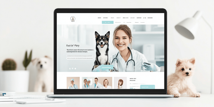
Responsive design is an approach to building websites where pages automatically adjust their appearance depending on the user’s device. This format does not lose structure even on small screens, where text remains readable and graphics are displayed correctly without the need for zooming or horizontal scrolling. The visitor interacts with the site effortlessly, and browsing is perceived as convenient and natural. The result is a unified experience across devices, whether the site is opened on a phone, tablet, or computer.
The importance of this approach lies in its direct impact on how the company is perceived and positioned in the market. Convenience translates into trust in the brand, and repeat visits turn into a steady flow of customers. Search engines also play their part by favoring sites with high-quality responsiveness, ranking them higher and attracting more organic traffic. Other articles we publish explain in more detail whether a responsive version of a site is necessary, using real examples to highlight all the benefits of this solution.
The impact of responsiveness on key business indicators
The main benefits of implementation include:
- Reducing bounce rates and loss of potential clients. Responsive design makes the site convenient to view on any device, improving information accessibility and reducing the likelihood of visitors leaving quickly.
- Increasing page depth and session duration. Flexible structure allows users to comfortably navigate between sections, deepening interest and extending time spent on the site.
- More leads and purchases from mobile traffic. Optimization for smartphones and tablets ensures a simple process for actions such as placing orders, directly impacting sales volume.
- Direct growth in online sales in the long run. Consistent convenience builds trust in the brand, and repeat visits gradually turn into real purchases.
- Advantage in search rankings thanks to mobile-friendly design. High-quality responsiveness is treated by search engines as an important SEO factor, leading to faster indexing and higher positions in results.
- A unified administration system instead of duplicating versions. A single responsive resource eliminates the need to separately support mobile and desktop versions, simplifying content management.
- Lower costs for maintenance and updates. A single flexible website foundation reduces expenses for technical improvements, allowing focus on platform growth.
Technologies that ensure correct site performance across screens
Anyone who wants a technical website support and ensure its stable operation should pay attention to the following technologies and tools that effectively enable responsiveness:
| Frameworks with responsive layouts (Bootstrap, Foundation). | They use ready-made grid systems and classes like .col- or .container-fluid, allowing the layout to automatically adapt to the viewport width without rewriting styles manually. |
| CSS grids for building flexible layouts. | CSS Grid and Flexbox technologies allow relative sizing of blocks using properties such as fr, flex-grow, or minmax(), ensuring smooth rearrangement of elements on any screen. |
| Media queries for controlling styles across devices. | With @media (max-width: …) or @media (min-width: …) rules, separate styles can be created for mobile, tablet, and desktop versions while keeping a unified structure. |
| Image optimization tools (WebP, responsive-srcset). | Using WebP together with the srcset attribute in <img> reduces image weight by 30–40%, automatically loading the right resolution for the specific device. |
| Mobile-first as a design strategy. | This approach creates base styles for mobile devices, then scales the layout up to tablets and desktops using @media (min-width: …). |
| Testing in Chrome DevTools and device emulators. | Device Toolbar checks display across dozens of screen sizes, while the Lighthouse module evaluates load speed and performance metrics. |
| CMS plugins and modules for responsive content. | Tools like WPtouch or Elementor Responsive Controls in WordPress automatically adjust widgets and sections for different screen sizes, simplifying site administration. |
How responsive website design is implemented
When speaking with clients about why a responsive online store is important for sales, we always start with a detailed analysis of the current state of the site. We carefully examine how pages display on different devices, how quickly content loads, whether navigation is clear, and whether any elements create difficulty. This helps us immediately identify weak points and form a list of necessary changes, creating an action plan where design solutions are complemented by appropriate technical updates. Thanks to this, all subsequent work proceeds logically and consistently, without chaos or unnecessary rework.
The process continues with gradual implementation of the defined tasks. Our designers create layouts that adapt to various screens, while developers configure grids and styles so every page looks complete and correct. At the same time, we optimize images and interactive blocks, testing changes in browsers and on real devices. The work concludes with mandatory site testing to confirm stability and usability, ensuring equal comfort regardless of access format.

Tips for maintaining responsiveness after site launch
The main points include:
- Regular SEO audits with resource security checks. In addition to technical parameters, it is important to assess security, so learn in advance what an SSL certificate is and select the best option for your project.
- Periodic monitoring of display on new device models. Regular testing ensures layouts adapt properly across screens, maintaining usability quality.
- Timely updates of the content management system and integrated modules. Keeping CMS and plugins current ensures stable site performance, improves productivity, and reduces the risk of technical issues.
- Monitoring page speed after each content update. Continuous tracking of loading speed prevents drops in SEO indicators, maintaining high conversion rates.
- Optimization of media files for different formats and resolutions. Using WebP and similar solutions guarantees faster content display, positively impacting user experience.
- User behavior analytics to identify usability issues. Web analytics data helps track how visitors interact with the resource and promptly eliminate barriers that reduce sales.
- An organized system of technical support and scheduled updates. Well-structured maintenance ensures uninterrupted site performance, timely error resolution, and stable development of the web service.
Do you want a turnkey website development with special attention to responsiveness and convenient user interaction? That is not a problem for us. The experienced specialists at QuatroIT are ready to take on project auditing and integration of the required technical solutions, carefully following all requirements and real client needs. Contact us and leave your request today – our team will not let you down!
- Responsive design for a modern website – what it is and why it matters
- The impact of responsiveness on key business indicators
- Technologies that ensure correct site performance across screens
- How responsive website design is implemented
- Tips for maintaining responsiveness after site launch


